 |
|
|
Use white backgrounds Sunday, November 27, 2005 Use white backgrounds
Blogged on ~~~ Fit text in a placeholder or autoshape Thursday, November 17, 2005 Fit text in a placeholder or autoshape Blogged on ~~~ 8 Secrets to a Knockout Business Presentation Tuesday, November 15, 2005 8 Secrets to a Knockout Business PresentationBy Darrell Zahorsky The presentation is starting. Dim the lights. Time for a nap. These are the thoughts of many audiences subject to yet another boring business presentation. How can you awaken the cognitive powers of your audience? Start by learning the 8 secrets of a knockout business presentation. Dig Deep: Having an effective business presentation that will have the audience on their feet requires more than the usual factoid dropped into your PowerPoint. Find a relevant fact beyond your topic norm. Give them the unexpected. The one obscure and contradictory piece of information that will raise heads and stimulate discussion. Where do you find such information? Go past the typical quick search engine scan. Check out educational websites for new research, interview industry mavericks, or scour the business press. Avoid Info Overload: PowerPoint expert Cliff Atkinson, author of "Beyond Bullet Points" says, "When you overload your audience, you shut down the dialogue that's an important part of decision-making." He points to some important research by educational psychologists. "When you remove interesting but irrelevant words and pictures from a screen, you can increase the audience's ability to remember the information by 189% and the ability to apply the information by 109%," recommends Atkinson. Practice Delivery: A knockout business presentation is so captivating it makes you forget about the speaker and become absorbed in the talk. Practice your delivery over and over until you remove the distractions including nervous tics and uncomfortable pauses. Pay particular attention to your body language. Is it non-existent or overly excessive? Good presenters work the stage in a natural manner. Forget Comedy: Business presenters will flirt with the temptation to deliver the stand up humor of Chris Rock. Remember your audience didn't come to laugh; this is a business presentation. Leave your jokes at home. It's ok to throw in a few natural off the cuff laughs but don't overdo it. Pick Powerful Props: You don't need a box full of props like the watermelon-smashing comic, Gallagher. A few simple props to demonstrate a point can be memorable in the minds of your target audience. Management guru, Tom Peters, uses a cooking timer to show how quickly factory expansion is occurring in China. Minimize You: "Frankly, your audience doesn't care as much about your company history, as they do about whether you can help them solve the specific problems they face. Write a script for your presentation that makes the audience the protagonist, or the main character, who faces a problem that you will help them to solve," says Atkinson. Speak the Language: A knockout business presentation doesn't leave people wondering what you said. It might be tempting to throw in a few big words but are you alienating your audience? Always explain terms and acronyms. The number of smart executives who aren't up on the latest terminology would surprise you. Simple Slides: Beware of the PowerPoint presentation. Many corporate brains will turn off at the sight of yet another PowerPoint presentation. Over 400 million desktops currently have the PowerPoint application. If you want your business to stand out, don't be like everyone else. Use slides in your knockout presentation to highlight and emphasize key points. Don't rely on your slide projector to run the show. It all comes down to what your audience walks away with in the end. Did you deliver another boring business presentation? Or did you persuade or motivate everyone to action? Apply the 8 secrets to a knockout presentation and watch your ratings soar. http://sbinformation.about.com/od/sales/a/presentationtip.htm Blogged on ~~~ White Backgrounds Sunday, November 13, 2005 Use white backgrounds
Blogged on ~~~ Way you presents .. Monday, November 07, 2005 The Six Rules of Web WritingBy: Merry Burns Source: Executive Update, Feature Article Published: November 2003 1. Create content for readers. 2. Show them the benefits. 3. Write to reach them. 4. Write more concisely. 5. Format for scanning. 6. Become interactive. Your Web site is your business card — your front door — and the first view visitors have of your organization. A well-written, well-designed site tells visitors what you are doing for them and how you are addressing their needs and priorities. People often make snap decisions based on what they see, and Web site content is no exception. Sometimes our decisions are erroneous. Associations that are truly member-driven may have sites that don't reflect it due to weak editing and editorial decisions regarding Web content and focus. Other sites look promising, with pricey designs, great visuals, and clever animation, but on second glance they have unreadable pages of dense text, a lack of reader focus, and myriad usability challenges. Fortunately, associations can do a lot to dramatically improve that crucial first impression and position themselves for repeat visits by customers, members, and other site visitors. Web editing and writing are skills that anyone can learn, and the payoffs — well-informed members, loyal customers, impressed donors, satisfied media, and more — certainly are worth the effort. Here are six guidelines to get your started. Create Content for Your Reader Before talking to designers and programmers, you should recognize that developing a visitor-oriented focus is the most important item in any Web content strategy. Too often, overworked managers bury this critical element deep beneath the complex physical business of creating or relaunching a Web site, learning a content management system, or deciding who does what for the site. As a result, the reader — the very reason for the site — is missing from the process. Perhaps the hardest part about Web content strategies is determining what's important to your readers as opposed to what's important to the organization. Your association's goals and those of your audience are sometimes aligned, but occasionally they may conflict. It's tempting to think that what drives the internal workings of the organization — the processes by which things happen — are important and need to be prominently displayed on your Web site. But sometimes these internal issues are the ones least likely to demonstrate that you are thinking about visitors' needs, problems, and goals. They don't work at your organization; why should they care? Look through the expansive pages of your site and ask yourself at each screen, "How well does this content address our visitors' questions and problems? Does this page show readers that we understand what's most important for them, or does it reflect primarily the meetings, processes, and tasks of the organization?" Note that the question is not "Are we giving our readers enough information about the workings of our organization?" but "Do we understand enough about our readers to know what they need our help with, and are we giving it to them on our Web site?" Show Them the Benefits When placing informational content online — current events, association news, calendars, or e-learning opportunities, for instance — association writers must edit the information for maximum impact, so members can see immediately why and how the information benefits them. Simply uploading information about an industry trade show and allowing members to register online are not enough. Tell them that attending the trade show will give them a unique chance to meet 500 potential buyers in their industry. Identify the specific ways the organization's event will meet their needs and desires. Share stories of real value gained from happy past participants. Analyze your content as you edit it to go online: * Can your products streamline members' workloads? * Will attendance at your next conference give people a huge discount on your products or a chance to interact with key speakers? * Will your online classes give customers a jump on their competition in clearly defined ways? As we increasingly rely on the Web for practical information, we're always looking for things that will help us work more efficiently, improve the quality of our jobs and home life, and keep us competitive. Showing your readers exactly how your information can help them achieve these goals is a good way to guarantee loyalty for your site. Write to Reach Them Text on Web sites should speak directly to the people you're trying to reach, so use appropriate language for the reader. Generally, Web writing styles are more conversational than in print, since we are, in effect, extending a friendly handshake to anyone who comes by and may be interested in what we're offering. Jargon is a disaster on Web sites, since the audience is global. Your Web site is not your intranet, and outside readers can't possibly understand in-house terms. A pontifical tone and a pedantic writing style make pages seem canned and artificial. We all are annoyed by Web sites that appear to talk down to us, are filled with excessive marketing hype, or are clearly written from an insider-only perspective. Writing for the reader in a more conversational tone also can ensure a clearer writing style, one that is more like the way we normally talk when explaining something. Clearer writing makes information more accessible, and readers are less likely to misunderstand what we're saying. Direct, clear, and friendly writing also draws an instinctive, positive reaction from the reader. Informational text, presented in question form and answered the way we'd answer someone verbally, makes readers feel included, not excluded. We appear to be simply talking to them, happy to provide them with information. Write More Concisely Reading online is harder than reading print. Most documents we put online come from print versions. They're written to be read line by line, page by page. Unfortunately, people generally do not read Web pages that way. Sun Microsystems, which conducts usability testing on the way people read text on their monitors, determined that approximately 79 percent of readers skimmed through a Web page, and only 11 percent read online text line by line, as they would for a print piece. Many physical reasons make online reading an uncomfortable experience. Staring at a screen makes your eyes weary, since you are focusing on fuzzy light. Indistinct text (much less legible than print) causes eye strain, especially when Web designers choose ridiculously small font sizes. Because few people enjoy reading lengthy documents online, it pays to make your writing as concise as possible, whether you're starting from scratch or editing a print piece to go online. Include everything you need to say but try saying it with fewer words. Writing more concisely allows the reader to get at the information with less effort, since less time is needed to read it. You may have read that everything you put online needs to be shortened by half. Not true. Sometimes just tightening the text a bit can make a huge difference. Writing with brevity online gets the meaning across faster and with greater impact and better reader retention. Usability tests show dramatic improvements in reader retention and comprehension with shorter text. Format for Scanning Those pages and pages of text on Web sites — each filled with long, unbroken paragraphs — are almost impossible to plow through in monitor-sized chunks. Too often, they are pulled straight from printed documents and "repurposed" as either a PDF document or a "Save As HTML" Web page. Your reader is scanning those pages, seeing only a small piece of the document at a time, looking for something, anything, to let them know what the information is about. Your readers are busy, impatient, and focused entirely on getting at the nuggets of information in your document. Thus, they will profoundly appreciate a skim-friendly format. Outline the ideas, concepts, points, or directions in your documents so readers can skim and retain the main points, understand any steps to follow, and grasp your most important concepts. Start the formatting process by thinking about questions your reader might have about the material: * Where is the keyword I'm looking for? Any phrases here look like possible candidates? * What's this page about? Do I have to read every word to find out what it means? * How long is this thing anyway? Use bullets, bold formatting, and spacing to create visual pathways through the material. Insert subheads over related paragraph blocks and make them shorter. It's a new way of thinking about processes you probably already know how to do. You also will need to thoroughly understand the document's content, because you may want to organize the information differently to create a clearer layout. Become Interactive The Web gives us tools that let us interact with our visitors in new ways. We can question, converse, and give instant feedback to members, customers, and others who want to do something on our site, whether ordering a book, registering for a conference, or finding directions for a meeting. Visuals, even something as simple as a diagram, often communicate ideas more clearly than text alone. Web tools, including anything from forms to Flash, can show processes, substitute for lengthy descriptions, describe concepts visually, set moods, and sometimes improve usability. Think of things that readers will want to do with your information. Can they do it online? From filling in forms or sending an e-mail query to selecting, buying, and evaluating products — all can be done online, saving time, phone calls, and steps. Ask questions of your own material. Can they be answered online? Is everything adequately explained by the text, or would a diagram be easier and quicker to understand? The degree of interactivity you choose varies according to your budget, goals, and information. Wise decisions at this stage will save you a great deal of money in the long run, and you won't be taken in by "cool tools" in the Web industry that are not all that useful. Writing in a style more appropriate for reading online, editing your print material to go up on your site, and developing a strong audience focus are imperative to the development of good, relevant Web content. The process can take as little or as much time as you can afford, and frankly, any effort is worth it. But a careful analysis of your content, followed by a discussion of what's working and what isn't and fixing it, are not optional steps in the process of creating Web sites that truly communicate with readers, convince them that your organization is there for them, and enable them to move easily through your online material. In the end, it all comes down to communicating, and the Web can be your biggest asset or a liability, depending on how you write, edit, and develop your site's content. The payoffs are true relationships with your readers and fewer headaches for your staff. Tight Writing for the Web Eliminate extraneous words and phrases that don't add much and that reduce retention and readability on a screen. The following three rules can help: 1. Trim synonymous words (basic and fundamental, true and accurate, each and every). 2. Edit redundant modifiers (each individual, past history, future plans). Kill l-e-n-g-t-h-y phrases. ("Those engaged in the profession of teaching" = "teachers." "Information from written sources" = "written information." "Retains in memory" = "remembers.") http://www.centeronline.org/knowledge/article.cfm?ID=2529&ContentProfileID=137787&Action=searching Blogged on ~~~ Using Visual Aids Sunday, November 06, 2005 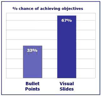  
One of the most powerful things that you can do to your presentation is to add in visual aids. Research shows that if you use visual aids you are twice as likely to achieve your objectives. Ditch the bullet points - use pictures instead. Professor Albert Mehrabian did a lot of research into how we take in information during a presentation. He concluded that 55% of the information we take in is visual and only 7% is text. There are some important conclusions that we can take in from this information 1. Use visuals (pictures, graphs, tables, props) whenever you can 2. In a speech you are only using 38% of the communication medium 3. Ditch the bullet points Visual Aids also making the presentation memorable In a Study at the Wharton Research Centre they showed that using visual sides had a dramatic effect on message retention. The effect of using visuals is truly staggering! The old adage that "a picture is worth a thousand words" is as true today as it has always been. Achieving your objectives If I said that I could double your chances of achieving your objectives in a presentation with just one piece of advice you would probably be very skeptical. And yet if you use visual images that is just what happens. This study by Decker Communications showed that by using visuals in your presentation you could expect roughly to double the chance of achieving your objectives. And if you are trying to make a sales presentation or a job interview presentation, this piece of advice could have a major impact on your bank balance. The conclusion: Use visual aids Blogged on ~~~
Marketing Challenge: Ducking Presentations That Bore by Meryl K. Evans and Hank Stroll You're sitting on a hard chair, constantly shifting position, trying to get more comfortable. The speaker doesn't keep your mind off your discomfort, since he is reading precisely exactly what's on the slides. Unfortunately, you have to squint to read it, because he squeezed two pages of content in 10-point type on each slide. Sound familiar? To prevent this scenario, a recommended guideline is the 10/20/30 rule: 10 slides in 20 minutes with 30-point type. PowerPoint has gotten a bad rap. It's not the program's fault that presentations fail to hold an audience's attention. It's the presenter who is at fault. Can't seem to rivet your audience? Check out the great tips below and you should be a presentation star in no time. Snore... Snore... Ducking Presentations That Bore Presentations have gotten out of control, as people use cookie-cutter templates with 10-point font and over 20 words a page. We believe presentations should sing, zing and ring audiences. We're working on marketing a new invention, so that means lots of presentations and explanations. What are the elements in a successful presentation that have worked for you or that you've seen in a presentation? —Janet, Marketing Manager Here are three tips from readers on how to make presentations sing: 1. Try the George Carlin approach—humor. 2. Think beyond PowerPoint. 3. Show what's in it for them. Try the George Carlin approach—humor Jerry Bader, partner at MRPwebmedia, agrees that presentations should sing, zing and ring audiences: In practical terms, that means your presentations have to speak to your audience in a human voice. Create a conversation, not a dry, dead-from-the-neck-up sales pitch full of features, specifications and "aren't we great?" stuff, but a signature voice that communicates how your new innovation will help solve your viewers' problems. Presentations are entertainment, and if you want to attract attention, generate interest, stimulate desire and action, then you should think George Carlin, not Harvard Business Review. Another creative suggestion, from Dr. Debby, takes a different approach to dueling banjos: Try PowerPoint vs. Post-It Notes! They need not be mutually exclusive. By being creative in PowerPoint, you can make it look like you have Post-It Notes superimposed on your PowerPoint slides—and through the use of animation tools make them look like they tear off once finished with them! Think beyond PowerPoint Your mode of communication depends on the type of information you're delivering and on the audience, advises Jessi LaCosta, communications coach with BlueRio Coaching: Not everyone can get away with this, but if at all possible nix the PowerPoint. Try opting for interesting props and interactive material instead. You can start with a creative icebreaker. In fact, I had a group play a game of "operator," which I started; and I placed some very odd details into the storyline about why I was there and what they would learn. When it came time for the final person to present the story, we were all laughing. Furthermore, I gained valuable insight into the audience's state of mind. Then, I adjusted my delivery accordingly. (Obviously, something like this may work better in a casual atmosphere.) You could also create a presentation like a magic show—invite members of the audience on stage to be your "personal assistant" and reveal your solutions to them in a dramatic and fun way. Use a personal connection where possible, engage your audience with anecdotes that are memorable and that most of your audience can relate to—of course, there is a fine line in overdoing this. At least for me, the ability to "humanize" the presentations by infusing humor has proved successful. Sunil Shibad, creative director with The Flea Communication, recommends doing the opposite of what everyone else is doing: If all your competitors are putting together fancy PowerPoint presentations, you should use Post-It Notes. If they quote some marketing guru, you should avoid quotes. Play a song. If they fire booming cannons, bring in a mime. The trick is to bring in some humanity, some soul, some heart. Be like a jazz musician and improvise. Lisa Dreher, vice-president of marketing and business development at Logicalis, goes back to knowing the audience: I have been in the position of having to give many presentations to sales representatives over the years. They are one of the more challenging groups to keep engaged. They typically pay attention about five minutes then they're off checking their Blackberry or stepping out of the room to answer a call. One of the best sales presentation methods I have used is making the presentation a game. I have done Jeopardy and Millionaire shows as presentations to sales people. I usually start creating my questions based on the key messages I want to be sure to communicate. Then I tailor the questions to provide an opportunity to expand upon a topic. The answers to the questions provide a starting place for commentary. Audience participation keeps the audience engaged and enhances learning. This method is only effective with certain audiences, but if you have the right audience, you will get raves on this method. It makes learning fun and keeps a tough-to-please audience in the room. Too daring? You can always try a softer approach of these suggestions. Start small and see how it works out. Also, we have just finished reading a book that provides inspired suggestions for punching up presentations from the folks behind Bullfighter. Show what's in it for them Good ol' reliable benefits still make a difference. If you're selling a pencil, people will be more interested in knowing that it leads to less cramps than the fact it's made of such-n-such material. Allan G. Lie, creative director, explains the benefits approach: First of all, remember that the audience doesn't care about you. Not even a little bit. Your presentation has to immediately tell what the benefit will be to them or their organization. Describe the results first, and then tell them how you'll get them there. If you're just hoping the product will be a benefit for them once you explain its features, you haven't done your homework. And skip all the technical language unless your audience completely understands it. You don't need to impress them with your credentials... you need to communicate with them—and that means talking the way they talk, about the things they talk about. A technique that could work well with a new invention is to open by listing all the things your potential client would like to have, but can't get. Then make a statement like "Imagine one product that could take care of it all!" Follow up by going through the list one item at a time and demonstrate that your product will deliver. Don't worry about the zing, sing and ring. If you're passionate about your product, your audience won't be able to keep themselves from getting excited as well. If you're not confident and excited about what you're presenting, find someone who is. It doesn't matter if you have video clips, a custom-written song, a dancing bear or fireworks going off in the boardroom—gimmicks are entertaining, but they don't sell. A reader recommends using fewer words and provides excellent insight: Products or services in action are the best proposition. Your presentations should show moving video and audio to supplement the dry stuff. Impact is king. If you are presenting a new idea and a new invention...the first two questions a prospect will ask you is (1) How much will this cost me? and (2) What will I have to do to benefit? They are more interested in how it will impact them rather than the product benefits. Within the team of prospects that you present to...your proponents will be lukewarm, but your detractors will be the ones that tend to lose the most with the implementation of your new invention. In other words, who you present to is more critical than what. To circumvent that—show in your presentation how your invention will make life better for everyone. Show them a sample and how to use it. Show a mock or a display model if possible. Also, I find that if you have two speakers, it breaks up the monotony. As always, do a dry run for everything to make sure it works before D-day. Dr. Debby reminds us to consider the basics: In addition to making your text legible, make your graphics easy to see. Use few images per slide (KISS: Keep it Simple, Sweetie!), make them large—especially charts and graphs with numbers, and make them contrast highly with the background. By the way, even if you use materials from hard copy that incorporate small text, you can always find a way to increase their size in PowerPoint. It's not easy creating a presentation these days. We have so many media choices to use in presentations that it can be overwhelming. Also, our audience has shorter attention spans with gadgets like cell phones and Blackberries distracting them. Readers' creative suggestions should help you hit a homerun on your next presentation. Blogged on ~~~
Improve your bar charts
Blogged on ~~~ |
.:Find Me:. If you interested in content, please contact the Writer .:acquaintances:.
The Enterprise .:Publications:.
Telegram Buat Dian .:Others:.
The Stories Blog .:New Books:. .:talk about it:.
.:archives:.
.:credits:.
|